10
$\begingroup$

What I understood is that when a site goes from public beta to production that it gets a final design. This design is created in close discussion with the community. Maybe we could think ahead a bit and discuss in what direction the site design should take us.

  • For instance, we could go with a site that takes design hints from IT security, but I think that misses the point; we're not interested per se in achieving system security.

  • An obvious thing to include would be a key and padlock. But personally I think that doesn't highlight the mathematics that is involved.

  • As background we could maybe do something with mathematical formulas, describing some kind of probability or order calculation.

  • We probably need to put the XOR operator somewhere in the design.

  • Of course we could go with something that uses a modern type set on what basically looks like white noise. In that case we're already there :P

Or we could just wait for the process to start of course. I was thinking of setting up a set of requirements for the design, but I don't think designing a site should work that way, lets just look at possible directions or sketches.

$\endgroup$
6
  • $\begingroup$ The design team would happily take suggestions under consideration as they work up the look and feel. $\endgroup$
    – hairboat Staff
    Commented Mar 9, 2015 at 23:17
  • $\begingroup$ @abbyhairboat Is that already in progress? $\endgroup$
    – Maarten Bodewes Mod
    Commented Mar 10, 2015 at 0:11
  • $\begingroup$ Nope, but it's in the (admittedly very long) queue. $\endgroup$
    – hairboat Staff
    Commented Mar 10, 2015 at 0:12
  • 10
    $\begingroup$ This site is mainly about modern crypto. So we should be careful that the design doesn't give the impression that we're about mainly about historic ciphers. I don't have a problem including them as long as they don't dominate. For example our current ad is a good design, but not one I'd like for the site. $\endgroup$ Commented Mar 11, 2015 at 10:20
  • $\begingroup$ @CodesInChaos Or blocks of ciphertext. I think a hint at the mathematical syntax and the binary inclination of modern crypto would be certainly be good. $\endgroup$
    – Maarten Bodewes Mod
    Commented Mar 11, 2015 at 10:23
  • $\begingroup$ @CodesInChaos Absolutely agree. In fact, if you´ld ask me I´ld honestly have to say that none of the ads would be a good base for site-design… at all! $\endgroup$
    – e-sushi Mod
    Commented Jul 1, 2015 at 12:14

6 Answers 6

7
$\begingroup$

Here's my effort (click for the full-size image):

cryptography header proposal

As you can probably see, it's just a combination of a CBC encryption chain on the left, and a load of random ones and zeroes on the right. I'm using Bank Gothic as the typeface.

$\endgroup$
9
  • 1
    $\begingroup$ Nice, very modern. Do we have to use CBC though? $\endgroup$
    – Maarten Bodewes Mod
    Commented Sep 17, 2015 at 13:44
  • $\begingroup$ @MaartenBodewes No, of course not :-) $\endgroup$
    – r3mainer
    Commented Sep 17, 2015 at 13:48
  • $\begingroup$ Tried to copy your crypto image as header into the page design I made, but the light blue is tricky to integrate into a page design, especially mine. It kinda forces the whole page to look ultra modern :) $\endgroup$
    – Maarten Bodewes Mod
    Commented Sep 17, 2015 at 13:51
  • $\begingroup$ Ah, thought about making the "Questions" button also in this font, but Bank Gothic itself is a commercial font. I was using librarions sans. Google Fonts seems to have an alternative though. $\endgroup$
    – Maarten Bodewes Mod
    Commented Sep 17, 2015 at 13:58
  • $\begingroup$ The alternative is here but I'm not sure it would be a good replacement. The distance between the characters is different, and the C and the A are noticeably different. $\endgroup$
    – Maarten Bodewes Mod
    Commented Sep 17, 2015 at 14:06
  • $\begingroup$ I can upload a demo of a reconfigured site with your logo if you want. That would be into your answer; I can remove it if you don't like it. $\endgroup$
    – Maarten Bodewes Mod
    Commented Sep 17, 2015 at 15:03
  • $\begingroup$ @MaartenBodewes Leave it for a while — I'll work on it if I find the time. It seems that Stack Exchange prefer to use their own designers anyway, so there probably isn't much point in producing a complete design at this stage. $\endgroup$
    – r3mainer
    Commented Sep 17, 2015 at 15:12
  • $\begingroup$ Yeah, I know. But it is a bit tricky to just come up with separate ideas without at least getting a feel about how they can be integrated. And I start to hate the light blue speckled banner of our site with passion :) Besides, it doesn't take that much time once you've got a design to adjust it. And it is fun and raining outside, of course. Showed it in my answer, let me know what you think. $\endgroup$
    – Maarten Bodewes Mod
    Commented Sep 17, 2015 at 15:17
  • $\begingroup$ Nice. I'm not sure I like the wave, but IMO the font and the CBC diagram work very well. And the wave's not too bad, either, I guess. $\endgroup$ Commented Sep 20, 2015 at 20:09
6
$\begingroup$

I seem to recall seeing a similar meta question before, but I can't find it now, so it might just be my memory playing tricks. Or maybe I was thinking of the community ads thread.

Anyway, if we're going to be tossing out random graphical metaphors for cryptography, here's a few possibilities, in no particular order:

(All images courtesy of Wikimedia Commons; click the images for source and licensing information.)

Obviously, there's no way the design can feature all of these things, but at least there's variety to choose from. The cipher disks and machines look suitable for foreground elements, while the diagrams and scans could be used in the background.

Personally, I'd at least like to see the design feature some protocol or algorithm diagrams (to symbolize modern cryptography) and some historical ciphers (to symbolize the roots of the field). I really like the cipher disk, and I think it (or something similar) might even have potential as the key element of the design (for the header, logo, etc.). It probably doesn't scale very well to small sizes, though, so we'd need some kind of a simplified logo for that.

Ps. Things I deliberately did not list include locks and keys (which I agree are overused, and not that closely linked to crypto) and circuit boards (which could equally well stand for any computerized field). That said, I would not categorically object to either of those as design elements, if they happen to fit the general design. In particular, while I don't really much fancy, say, a padlock as the site logo, it does have the virtue of scaling well to small sizes, which matters for things like favicons. If we find nothing better that works visually, I guess I could, reluctantly, live with a padlock logo.

$\endgroup$
2
  • 8
    $\begingroup$ Of your pictures, I think the ones displayed under data flow diagrams and elliptic curves speak most strongly to the site's focus. I would actively avoid the others. $\endgroup$
    – Reid
    Commented Mar 12, 2015 at 16:43
  • $\begingroup$ Yes I know, I´m late to the party. Anyway: my initial gut-feeling tends to agree with @Reid as I´m not sure if (and how well) objectification works with SE/SO site designs. On the other hand, there´s nothing stopping the SO/SE designers to put a dimmed, cut-off, grayscaled (or mono-colored) cipher-disk somewhere cornered in the background… which surely could provide an individual kind of charm which might just fit a site like Crypto.SE. (All in all, I think you gave a nice overview of options here. Guess it´s up to the “in-house design wizkids” to suck the merrit out of this to make it shine.) $\endgroup$
    – e-sushi Mod
    Commented Jul 1, 2015 at 12:10
5
$\begingroup$

I think we should be very careful to incorporate too much "Classical Cryptography" related stuff in our design. The majority of questions on this site are not classical cryptography. A lot of the classical cryptography related questions we get are really just "help me decrypt this vigenere/caesar ciphertext". If our design leans too much towards classical cryptography, we may end up attracting the wrong attention.

I personally really like the Network Engineering design. Very simple and clean, doesn't take a lot of site specific material to make it work, etc. Same thing for the Information Security site.

$\endgroup$
2
$\begingroup$

IMHO, padlocks and keys are overworked metaphors for cryptography, and not very exciting from the design point of view.

On the other hand, something like cipher disks or scytales could be more appealing ideas, with the added value that they are not metaphors of cryptography, but actual devices for encryption and decryption.

$\endgroup$
1
  • 4
    $\begingroup$ I'm leaning more and more to a more modern approach, so in my (current) opinion we should not go with historical artifacts. $\endgroup$
    – Maarten Bodewes Mod
    Commented Sep 16, 2015 at 15:55
2
$\begingroup$

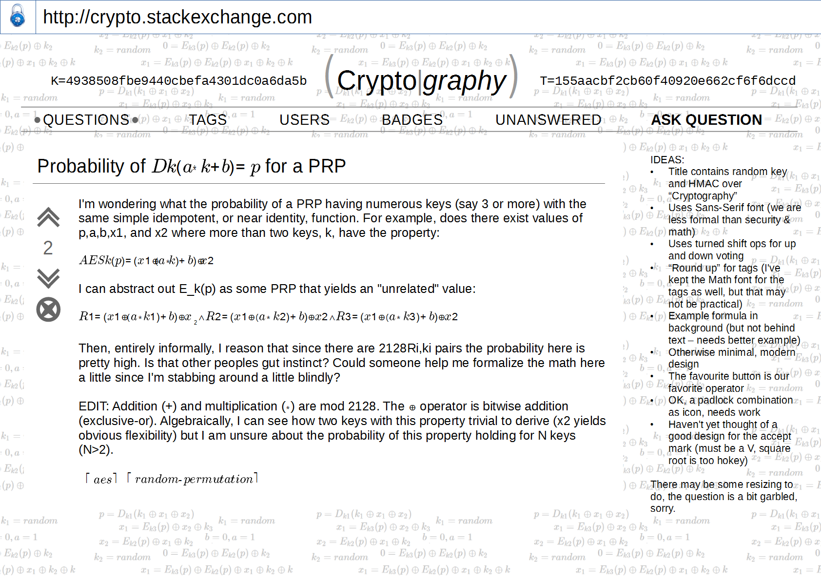
OK, I've got a bit more of a design going on, let me know what you think of the ideas expressed in the design! I guess that the background needs to be even softer, possibly light yellow or something. And we may need a bit more color :)

design v1

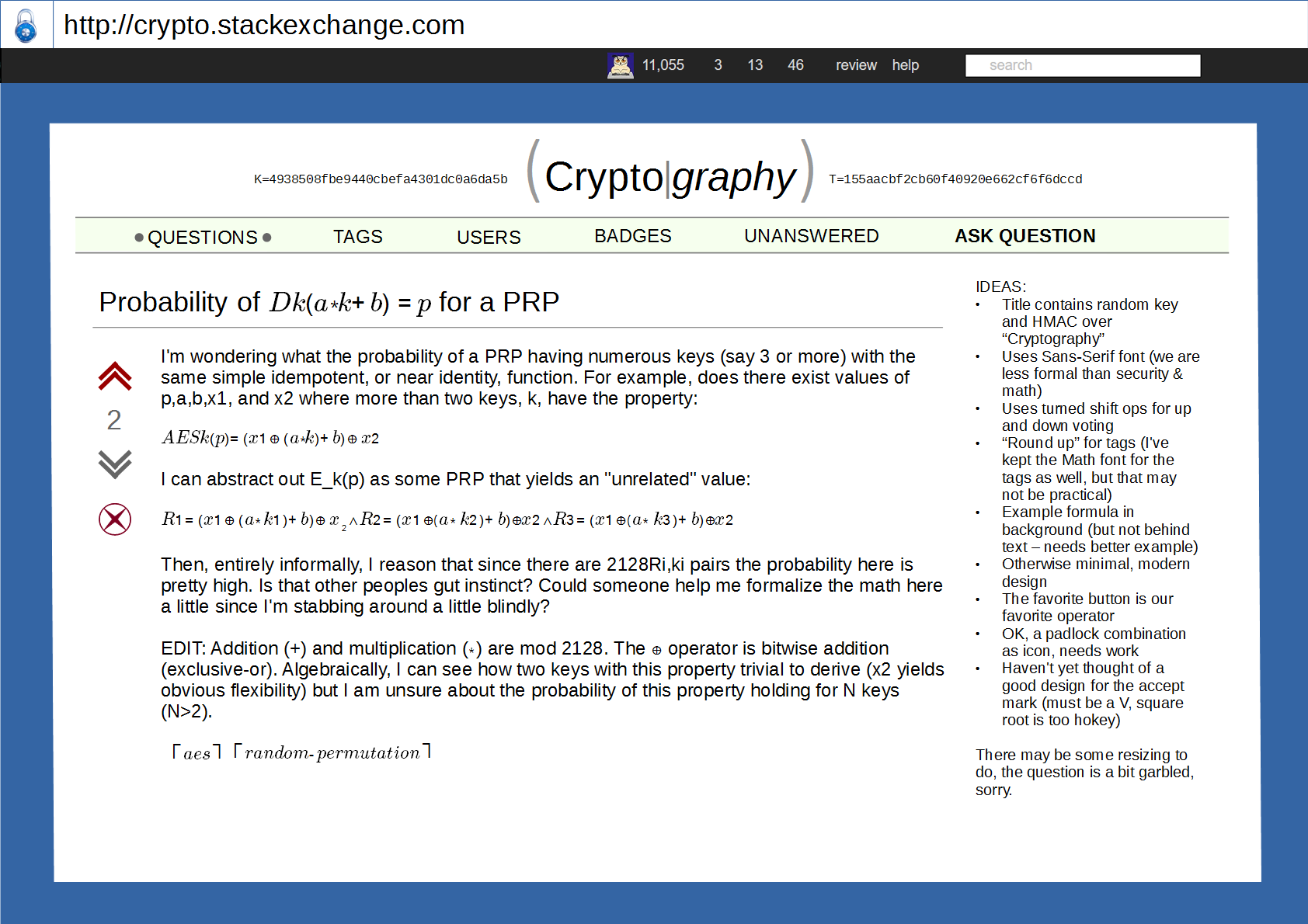
Cherry picking is allowed of course. If there are remarks that are upvoted enough I can change the design, it is a LibreOffice "Draw" document saved as PNG.

Another tack:

design v2

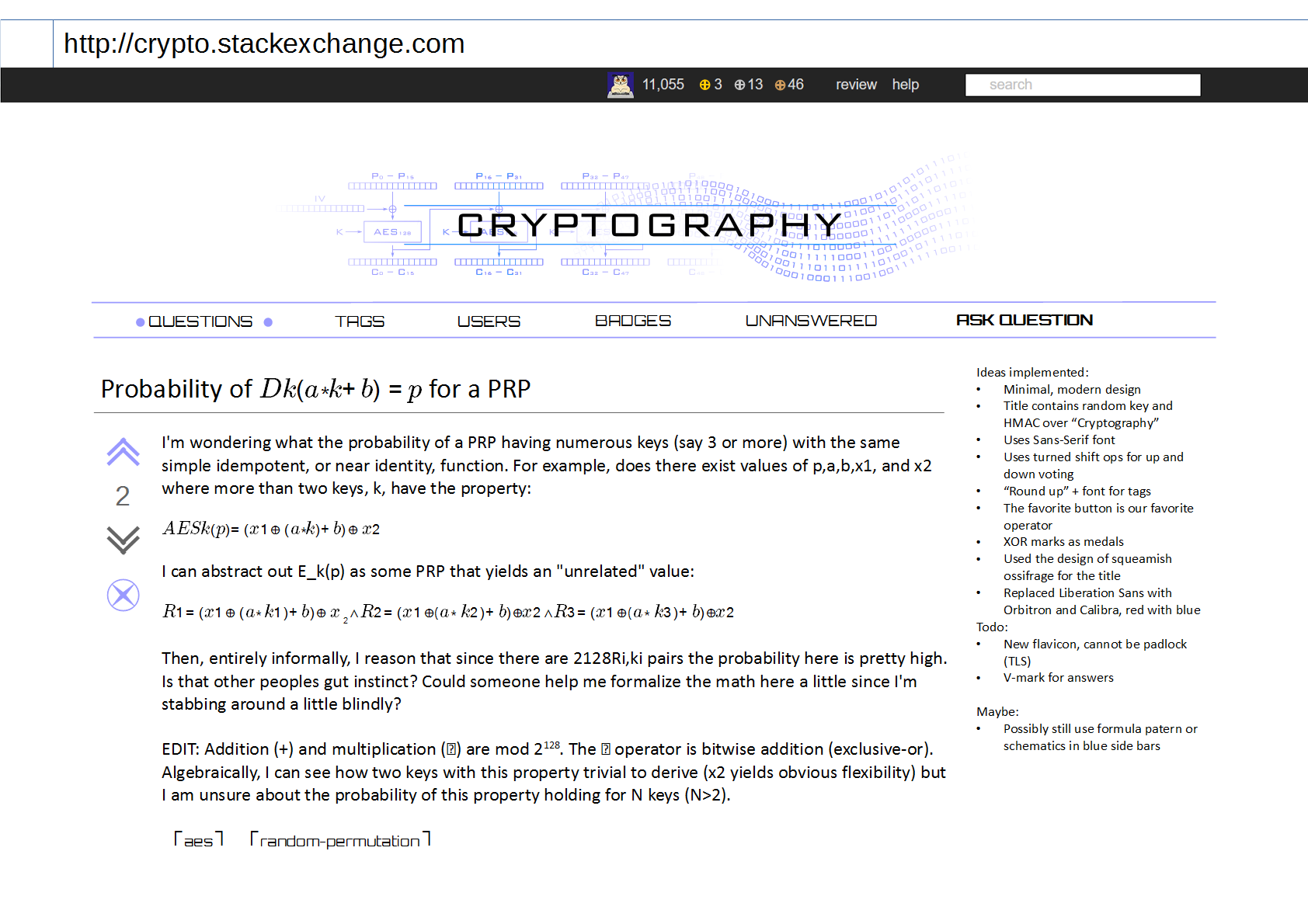
And one using the logo from squeamish:

enter image description here

$\endgroup$
11
  • $\begingroup$ I thought about a stylized key as accept button, but I haven't seen any SE sites that use anything other than a V mark, so we should probably not deviate from that to not alienate the user base. $\endgroup$
    – Maarten Bodewes Mod
    Commented Sep 16, 2015 at 18:50
  • 1
    $\begingroup$ Most SE sites have a white background except for the header. I think that's a good clean look that should be used here, too. I.e. that background you've got going shouldn't extend to the sides and footer. I like most of the other ideas you have there. $\endgroup$
    – otus
    Commented Sep 16, 2015 at 18:53
  • $\begingroup$ @otus I actually agree on that myself :) $\endgroup$
    – Maarten Bodewes Mod
    Commented Sep 16, 2015 at 18:54
  • $\begingroup$ Come to think of it, a padlock icon may give a false sense of security, it could be confused with an icon indicating TLS. $\endgroup$
    – Maarten Bodewes Mod
    Commented Sep 17, 2015 at 1:02
  • $\begingroup$ Are those random strings any meaningful? Could we actually make these strings a hash of the (current / front) page? $\endgroup$
    – SEJPM
    Commented Sep 17, 2015 at 18:43
  • $\begingroup$ @SEJPM The one is a "random string", the other is a HMAC-SHA256 over "Cryptography". k = key, t = tag as in authentication tag. I've used 16 bytes input/output for the key and tag because 32 bytes didn't look OK :P I thought about using the SHA-256 over "Cryptography" as key, but SHA-256 is not really a good KDF. We could use HKDF using SHA-256 of course. $\endgroup$
    – Maarten Bodewes Mod
    Commented Sep 17, 2015 at 18:47
  • $\begingroup$ @MaartenBodewes, can you guarantee (/prove) to not have somehow malicously backdoored that "random string"? I'm fearing this may get too non-transparent for us :P BTW you could use one of the more famous seeds for the key (NIST curve's seeds?) $\endgroup$
    – SEJPM
    Commented Sep 17, 2015 at 19:27
  • $\begingroup$ NIST curve seeds? Are you joking? I'd rather use the Brainpool seeds, the NIST curve seeds are of unknown origin. But I'll do it another way: I'll ask everybody here to think of a string and to comment underneath. The I'll concatenate all the strings together (in order) and take the ASCII encoding of it as seed for "SHA1PRNG" in Java SE 1.8.60 ("SUN" provider). $\endgroup$
    – Maarten Bodewes Mod
    Commented Sep 17, 2015 at 19:30
  • $\begingroup$ I wanted to give people a nice little crypto easter egg because the NIST seeds are (in)famous and the brainpool seeds are rather boring (based on the hex representation of pi and e IIRC) :P. I'll propose a string myself soon, but need to get something with some nice background for this. (Because, well, MD5("WARMACHINEROX") may not be too appropriate for this, which would be an example of bad password hashing + a bad password used in a movie) $\endgroup$
    – SEJPM
    Commented Sep 17, 2015 at 20:18
  • $\begingroup$ Well, currently the random string is "owlstead" as seed for "SHA1PRNG", I don't know what's worse. It kind of already was an easter egg., but it is a bit too sucky to be good one :P $\endgroup$
    – Maarten Bodewes Mod
    Commented Sep 17, 2015 at 20:23
  • 1
    $\begingroup$ @MaartenBodewes, I think these comments get a bit too crowded and may be hidden / invisible / unnoticable to some users. I'll open a meta question on which strings to choose as help for the designers. $\endgroup$
    – SEJPM
    Commented Sep 18, 2015 at 16:16
1
$\begingroup$

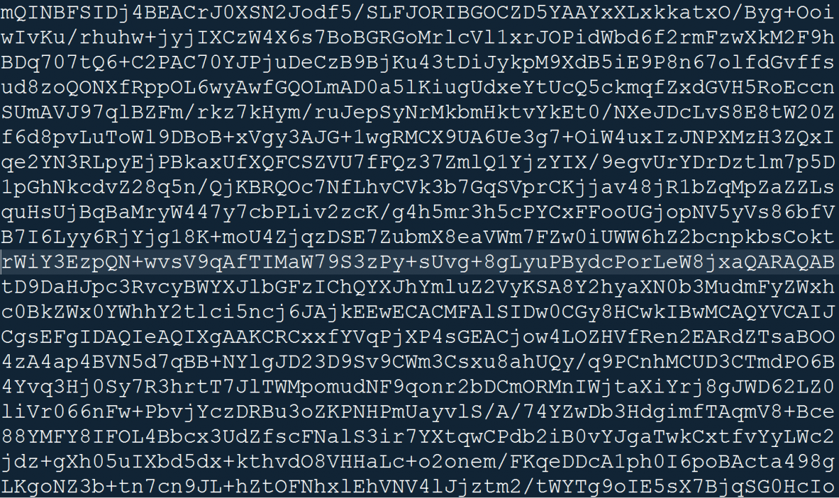
Images similar to these maybe are more appealing to a general community (they evoke something of a "hacker" style)

enter image description here

enter image description here

$\endgroup$
4
  • $\begingroup$ did you made the formulas on the first one? If so we may be able to use some more crypto-related ones. Is there any background on the cipher text on the second one? $\endgroup$
    – SEJPM
    Commented Sep 15, 2015 at 20:51
  • $\begingroup$ No, i just found them on the internet. They are just for inspiration $\endgroup$
    – cygnusv
    Commented Sep 15, 2015 at 21:00
  • 2
    $\begingroup$ I think we have to balance the hacker stuff, I think we should have a white background mathematical style site with things like keys, hexadecimals and such added to it. Definitely not black. $\endgroup$
    – Maarten Bodewes Mod
    Commented Sep 16, 2015 at 13:33
  • 2
    $\begingroup$ "Ciphertext" design conflicts a bit with the policy of not accepting decryption requests. $\endgroup$
    – otus
    Commented Sep 16, 2015 at 18:32

You must log in to answer this question.

Not the answer you're looking for? Browse other questions tagged .